


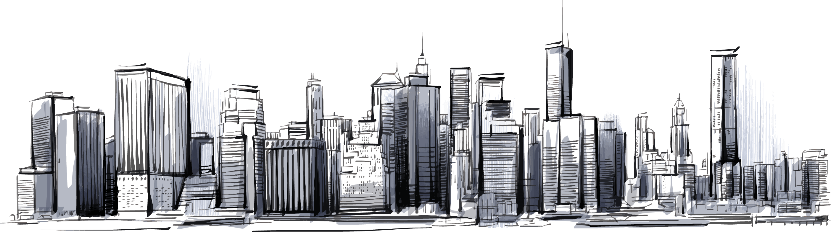
Responsive Web Design: What It Is And Why You Need It
Web design has become an indispensable tool for anyone with a digital presence As more and more small businesses expand their mobile presence their website eCommerce websites Google Business page social media pages and other content must be easily accessible on all devices The purpose of Responsive Design is to have a site with different elements that react differently when viewed on devices of different sizes.
A BRIEF HISTORY OF RESPONSIVE WEB DESIGN
The first website designed to adapt its layout based on the width of the browser viewport was Audicom which launched in 2001. Terms like fluid flexible liquid and elastic were used interchangeably to describe the same concept until developer. Ethan Marcotte coined the phrase responsive web design in a 2010 essay Marcotte also wrote a book in 2011 titled Responsive Web Design.
THE NECESSITY OF RESPONSIVE WEB DESIGN
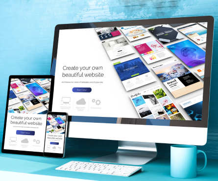
lmost every business these days wants a mobile version of their website from its Website Design Company in Noida Its even necessary after all one web design for the iPhone another for the iPad the BlackBerry laptop netbook Kindle and all screen resolutions must be compatible too In the next few years well likely need to design for a number of new inventions Usage of mobile devices to surf websites is seen growing at lightninglike speed so is responsive website design meaning a lot Here at Web Design Company in Noida {TYSAS} we give a solution for existing as well as to make a completely new mobilefriendly website We plan design and develop modern responsive websites that assure high conversion rates and traffic Also our capable and experienced team of responsive web developers makes customized responsive website design which avails your exclusive requirements Those days are gone when we just had to focus on creating visually appealing desktops or laptops website. A responsive site means that your website modifies devices between laptops desktops phones tablets more tons of different screen sizes. With the use of flexible layouts responsive websites look good on devices of all sizes Its not just about switching from desktop to mobile your website needs to be responsive. On the devices like iPhone plus or a Nook Tablet your website needs to shine with the help of Responsive Web Design {RWD}.
THE CONCEPT OF RESPONSIVE WEB DESIGN
HTML Responsive Web Design Noida is not only about adapting to different screen size but rather about a whole new way of thinking about design. We dont create different doors for different people that pass through it according to their size and type Responsive Web Design should automatically adjust like a responsive architecture. It shouldnt require a lot of custommade solutions for each new category of users Responsive Web design requires an intangible way of thinking Some common practices are fluid layouts media queries and scripts that can reformat Web pages and markup automatically. Avoiding unnecessarily resizing scrolling zooming or panning sites are the ultimate goals of Responsive Design that are not optimized for different devices It can also affect your potential customers who are frustrated with the way they do something these sites are often very difficult to navigate. While having a responsive website we dont require a dedicated mobile website for Smartphone users. The number of desktop users exceeds the number of mobile viewership, it will continue to grow worldwide with Smartphone availability.
HOW OTHER BIG BRANDS ARE USING IT
In terms of website design development the mobile friendly website design definition has changed in recent years. This means that your site performs well on mobile devices such as phones or tablets Mobile friendly mobile first responsive design adaptive design separate mobile website design or mdot website mobile apps maybe different terms in vogue. Second website design for mobile visitors only a business can specify which content actions are most important to that audience. Factors such as cost time ongoing maintenance must be considered in this mobile design option SEO strategies as well as mobile desktop versions implemented redesign or updating. One of the most popular companies on the mobile device ie Amazon its huge website is very difficult to use hence its app has been developed. Your both desktop mobile sites manage a customized version that may not be the best use of your resources. When deciding how to allocate resources for mobile optimization development all you have to do is review your web analytics to see how most people are using your websites.
HOW OTHER BIG BRANDS ARE USING IT
In terms of website design development the mobile friendly website design definition has changed in recent years This means that your site performs well on mobile devices such as phones or tablets Mobile friendly mobile first responsive design adaptive design separate mobile website design or mdot website mobile apps maybe different terms in vogue Second website design for mobile visitors only a business can specify which content actions are most important to that audience Factors such as cost time ongoing maintenance must be considered in this mobile design option SEO strategies as well as mobile desktop versions implemented redesign or updating One of the most popular companies on the mobile device ie Amazon its huge website is very difficult to use hence its app has been developed Your both desktop mobile sites manage a customized version that may not be the best use of your resources When deciding how to allocate resources for mobile optimization development all you have to do is review your web analytics to see how most people are using your websites.
ADVANTAGES OF RESPONSIVE LAYOUTS
With Responsive layouts the biggest advantage is the guarantee that every user on any device can get the best experience on their website Responsive website design advantages are to optimize the content of your website the great way is website responsiveness to also ensure that mobile users see only the most relevant information With an effective mobile experience a website will appear in the search results over one without To change your website layout based on the pixel width of the display device the website itself is just optimized Most of the responsive websites do a great job display content that looks attractive on a desktop monitor Your website should research these user experience design issues. At TYSAS responsive website design services are enabled to change the appearance of a website dynamically relying on the screen size of the device being used Also consider that our talented team of responsive web developers in Noida makes customized responsive website design that provides your exclusive requirements Using the latest tools and technologies our team builds your website more accessible through adaptive website design templates.
THE CORE INGREDIENTS OF RESPONSIVE WEB DESIGN
RESPONSIVE LAYOUTS
With responsive layouts your website adapts to screen size and orientation ensuring consistency across layouts Such a technique adjusts the layout to a great variety of screen sizes Not only for the common display dimensions and an average user but the responsive layout adapts to different viewing conditions and user requirements By having an alternate design for each resolution range we can enhance the overall viewing experience.
RESPONSIVE IMAGES
A Responsive Design isnt limited to changing the page layout only the images also need to adjust accordingly and there are a few ways to achieve it resizing the image proportionally or dynamically cropping it By using responsive web design we can do it automatically.
MEDIA QUERIES
Media queries help to develop a highly responsive website to view on any device With media queries designers can build many layouts with just HTML documents and choosing the right styling based on different criteria With elements like the size of a browser screen resolution we can entirely change the layout of the web page So instead of looking at a device type we consider screen resolution and browser size Media queries enable us to do finetuning of our pages by resizing them according to screen size resolution We can show or hide elements to make the navigation more prominent increase target area for links on different screens use responsive typesetting to optimize the reading experience for the display providing it.
BECOME RESPONSIVE
Switching to a Responsive Web Design Noida makes your website future proof as your design will adapt to any screen size Having a responsive website is a winwin scenario for both developers and clients Not only does it help to set and maintain a consistent look and feel on myriad devices but it also decreases the cost of doing this.
PROS OF RESPONSIVE WEB DESIGN
ONE WEBSITE TO MAINTAIN
It is so much easier to add and manage the page layouts for new devices than it would be to build and manage separate sites optimized for different devices.
SEARCH ENGINE OPTIMIZATION
Having a Responsive Website Improves Site Usability If the user can easily navigate your website its likely they can stick around Google recognizes average time on page as a fundamental indicator of a sites value for any given query Responsive web design in Noida makes your website much easier for users to read and navigate The result is an improved user experience with greater time on site Great usability scores lead to repeat visitors and increased conversions Responsive web design has become fundamental to positive user experience Google released an update to its ranking algorithm on April 21, 2015. It shows that more than half of online traffic more mobile usage was higher than desktop usage a year ago Mobile search engine results state that mobileoptimized sites are favored it requires website owners to improve their sites provide their users with better user experience Your search experience brand identity the users experience you provide can be improved by it If a user shares the site the recipient will always get a similar experience as there is only one URL.
IMPROVED USER EXPERIENCE
Responsive design isnt just about what device is used Most people dont keep their browser not in a fullscreen mode with responsive design youll never get a horizontal scrollbar which makes navigation harder Like any new approach responsive web design in Noida is delivered with its own set of hedges to go through Although there is undoubtedly a lot of work involved the advantages overshadow the disadvantages which is why we at TYSAS are in the process of developing responsive websites for a number of our clients.
Responsive Web Design What It Is And Why You Need It
Usage of mobile devices to surf websites is seen growing at its speed so is responsive website design meaning a lot Here at TYSAS we give a solution for existing as well as to make a completely new mobilefriendly website We plan design and develop modern responsive websites that assure high conversion rates and traffic Also our capable team of responsive web developers makes customized responsive website design that avails your exclusive requirements.
At TYSAS responsive website design services are enabled to change the appearance of a website dynamically relying on the screen size of the device being used Also consider that our talented team of responsive web developers makes customized responsive website design that provides your exclusive requirements Using the latest tools and technologies our team builds your website more accessible.
Responsive website design solutions we bring boost mobile conversion rates. Such websites are chosen by the search engines and so they carry your website more mobile traffic It is easier for the search engines to appreciate and provide your content when you make use of a dynamic version of your website for both desktop and mobile visitors So we are known enabled to create easy to use responsive websites that assist you to stand out of the competition.


